Help Users Choose Dates in Fewer Steps
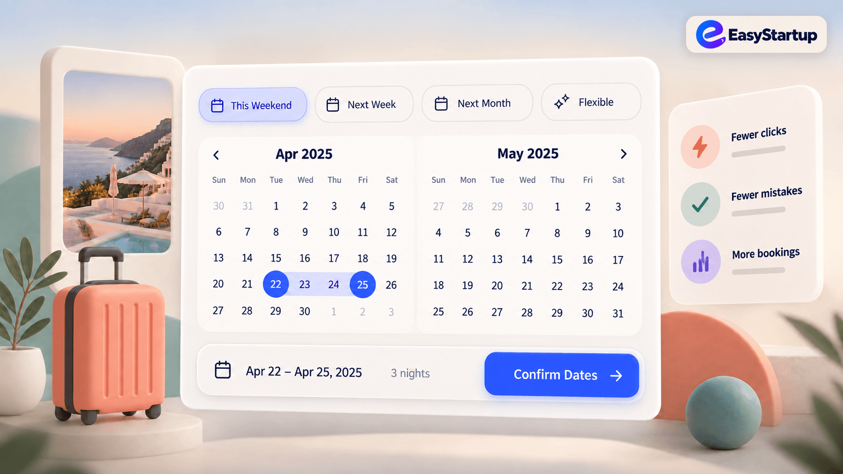
Make date selection predictable with sensible defaults, clear ranges, and formats that match the user’s task and context.
### The business goal
Help users complete important actions with less friction, fewer mistakes, and more confidence.
### The UX choice
Use date pickers that match the user’s mental model and the precision the task actually needs.
### What to design
- Start from a useful default such as today, the next available date, or the current range.
- Make month navigation and selected states obvious.
- Show date formats that match the user’s locale and context.
- Make range selection clear with start, end, and hover feedback.
- Allow direct keyboard entry when users already know the date.
### Practical implementation rules
- Prevent impossible dates and explain unavailable choices.
- Keep timezone and cutoff rules visible when they matter.
- Support keyboard and screen-reader navigation.
### What to avoid
- Opening on an irrelevant month.
- Requiring several clicks for a common date.
- Hiding the selected range or silently changing the timezone.
### Quick takeaway
The best date picker removes uncertainty before the user commits to a date.
Ready to make your website work harder?
Start a WhatsApp conversation about your website. We’ll help you understand what’s possible — no pressure, no jargon.