Show the Right Action at the Right Time
Design context menus around the user’s current object and intent so the next action is discoverable, relevant, and safe.
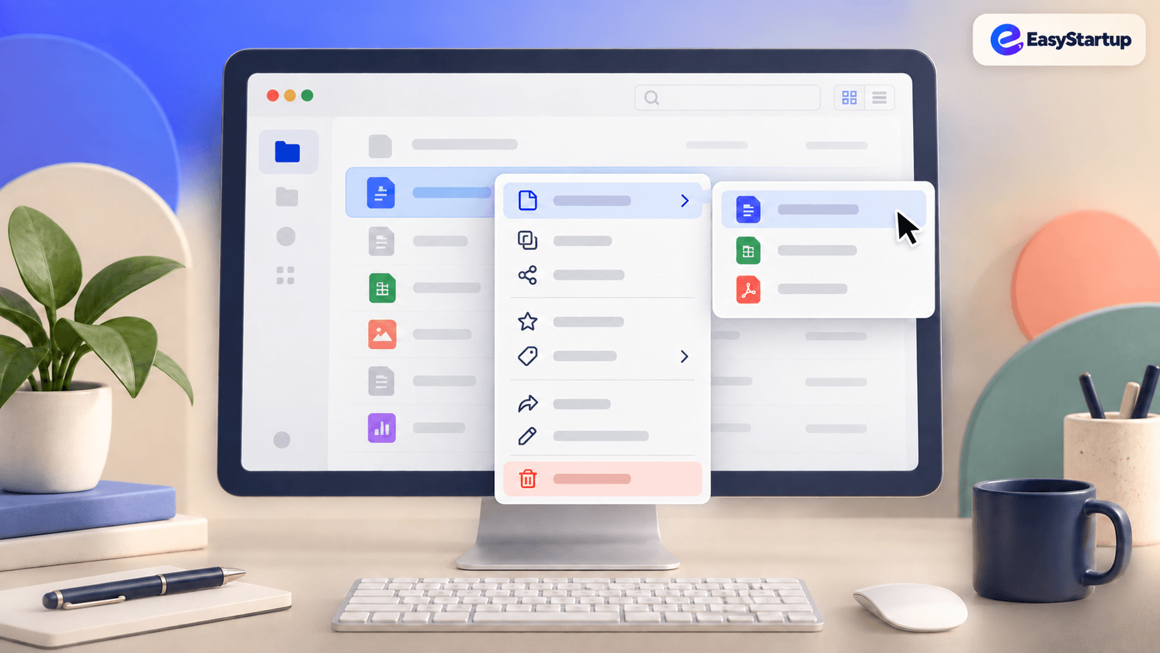
### The business goal
Help users complete important actions with less friction, fewer mistakes, and more confidence.
### The UX choice
Use context menus as a focused action system tied to the object the user is working with.
### Why this choice works
A context menu reduces scanning when it surfaces the actions that matter now. Relevance builds confidence; a long generic menu creates hesitation.
### What to design
- Show actions for the selected object, not an unrelated global list.
- Keep the menu close to the pointer or keyboard focus.
- Group common actions first and separate destructive actions visually.
- Support keyboard access, touch alternatives, and Escape to dismiss.
- Update the menu when selection or permissions change.
### Practical implementation rules
- Make the trigger and focus state obvious.
- Keep labels specific and action-oriented.
- Confirm or offer undo for destructive actions.
### What to avoid
- Hiding essential actions only in a right-click gesture.
- Showing disabled or irrelevant commands without explanation.
- Letting menus open off-screen or disappear before keyboard users can act.
### Quick takeaway
A good context menu makes the next relevant action feel close, clear, and safe.
Ready to make your website work harder?
Start a WhatsApp conversation about your website. We’ll help you understand what’s possible — no pressure, no jargon.