Help Users Choose Colors with Confidence
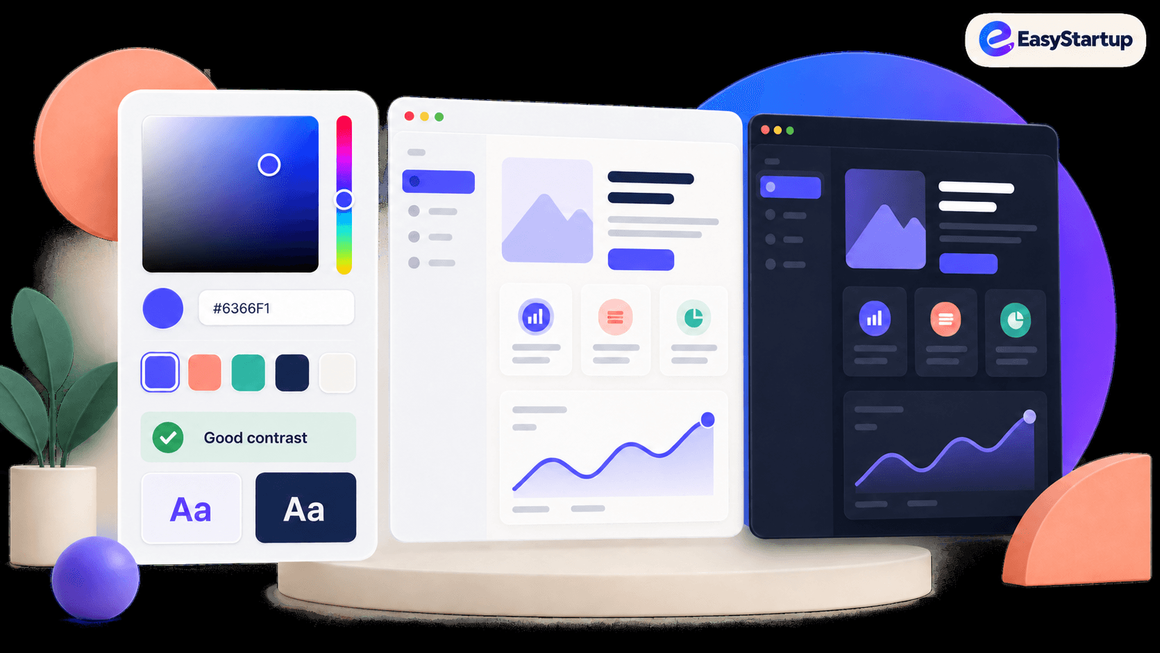
Pick a color with confidence through thoughtful UX that reduces friction, prevents mistakes, and makes the next action clear.
### The business goal
Help users complete important actions with less friction, fewer mistakes, and more confidence.
### The UX choice
Use Color Picker UX as a deliberate product decision, not as decoration or a default component.
The starting point is simple: Pick a color. Your whole UI answers. The interface should make the user's intent visible, keep the consequence of each action understandable, and remove friction only where it does not reduce trust or control.
### Why this choice works
When this pattern is treated as a business lever, it can reduce hesitation, prevent avoidable errors, and make the next action feel obvious. When it is added without a clear purpose, it can create noise, hidden behavior, or unnecessary friction.
For a startup, this matters because small UX decisions compound across acquisition, activation, retention, and support. A clear pattern can shorten the path to value. A confusing one can turn a routine moment into a reason to abandon the product or contact support.
### What to design
- Treat the picker as a decision tool, not a gradient with a slider — every choice cascades into the rest of the UI.
- Offer OKLCH next to hex so one number maps to a predictable shade.
- Give the picker memory with recent swatches and saved palettes.
- Show a live contrast ratio at pick time, not only in review.
- Preview alpha over a checkerboard on both light and dark backgrounds.
### Practical implementation rules
- Expose human-readable formats like OKLCH.
- Surface recent swatches and saved palettes.
- Validate contrast live while picking.
### What to avoid
- Previewing alpha only on white.
- Shipping a bare gradient-and-slider picker with no memory, contrast check, or palette output.
Do not copy the pattern mechanically. Identify the user decision it supports, then choose the simplest version that makes that decision easier. Test with real content, device sizes, keyboard navigation, and slow or failed network conditions.
### Easystartup publishing angle
Frame this topic around how a small product decision can improve a measurable business outcome. Use an example from onboarding, checkout, dashboards, or marketing pages.
### Quick takeaway
A good Color Picker UX choice makes the user's next step clearer while supporting the business outcome behind it. Start with the goal, then let the UX pattern earn its place.
Ready to make your website work harder?
Start a WhatsApp conversation about your website. We’ll help you understand what’s possible — no pressure, no jargon.