Make Your Website Look More Professional With Consistency
Same card. One looks off, one looks expensive. The gap is one CSS rule Help users understand and act on information quickly without visual overload.

The business goal
Help users understand and act on information quickly without visual overload.
The UX choice
Use Border Radius as a deliberate product decision, not as decoration or a default component.
The starting point is simple: Same card. One looks off, one looks expensive. The gap is one CSS rule. The interface should make the user's intent visible, keep the consequence of each action understandable, and remove friction only where it does not reduce trust or control.

Why this choice works
When this pattern is treated as a business lever, it can reduce hesitation, prevent avoidable errors, and make the next action feel obvious. When it is added without a clear purpose, it can create noise, hidden behavior, or unnecessary friction.
For a startup, this matters because small UX decisions compound across acquisition, activation, retention, and support. A clear pattern can shorten the path to value. A confusing one can turn a moment that should feel routine into a reason to abandon the product or contact support.
What to design
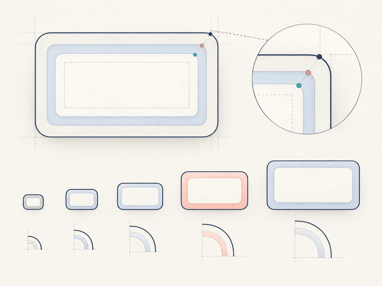
- Nested corners follow math: inner radius = outer radius − padding. When the concentric curves line up, a card reads as intentional instead of "off."
- Pull every value from one radius scale (4 · 8 · 12 · 16 · 24) instead of picking numbers per component — consistency is what makes UI look expensive.
- Scale radius with element size: tooltips ~4px, inputs ~8px, cards ~12px, modals ~16px, panels ~24px. Bigger surfaces earn bigger corners.
- Radius carries personality — small/sharp reads corporate, large/round reads friendly. Pick the range that matches your brand's tone.
- The difference is subtle but felt: off-scale, mismatched corners are exactly what separates "something's wrong here" from polished.
Practical implementation rules
- Derive the inner radius from the outer radius minus padding so nested corners stay concentric.
- Commit to a single radius scale and reuse it across every component.
- Scale radius with element size — larger surfaces get larger corners.
What to avoid
- Pick radius values at random for each component.
- Nest a rounded card inside another without adjusting the inner corner.
- Mix a playful, oversized radius into a brand meant to feel serious — or the reverse.
Do not copy the pattern mechanically. First identify the user decision it is supporting, then choose the simplest version that makes that decision easier. Test the design with the real content, real device sizes, keyboard navigation, and slow or failed network conditions where relevant.
Easystartup publishing angle
Frame this topic around a familiar startup problem: how a small product decision can improve a measurable business outcome. Use an example from onboarding, checkout, dashboards, or marketing pages so readers can connect the UX principle to work they are already doing. The strongest takeaway is not a visual rule by itself; it is the reason that rule helps users move forward.
Quick takeaway
A good Border Radius choice is one that makes the user's next step clearer while supporting the business outcome behind that step. Start with the goal, then let the UX pattern earn its place.
Ready to make your website work harder?
Start a WhatsApp conversation about your website. We’ll help you understand what’s possible — no pressure, no jargon.