Prevent Lost Work and Build Trust With Autosave
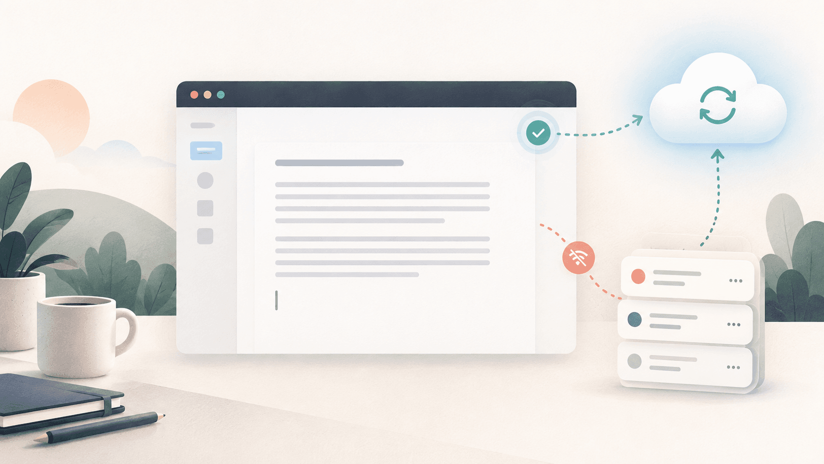
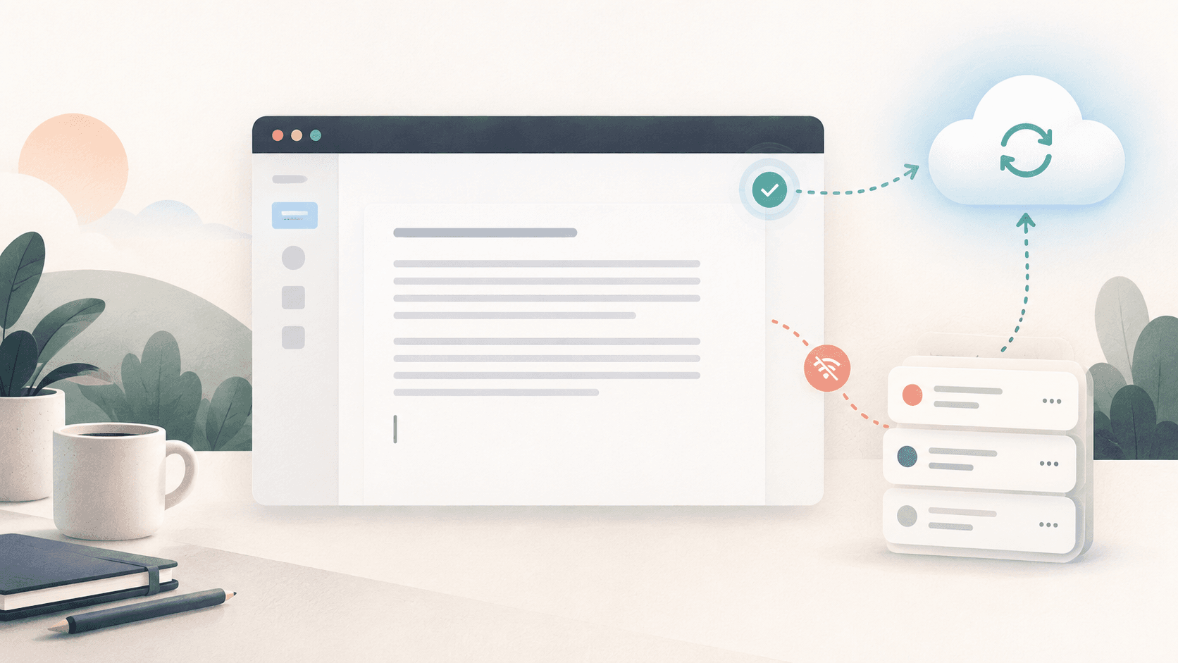
Saved. It wasn't. Your wifi died mid-word Help users enter accurate information while reducing hesitation and abandonment.
The business goal
Help users enter accurate information while reducing hesitation and abandonment.
The UX choice
Use Autosave as a deliberate product decision, not as decoration or a default component.
The starting point is simple: Saved. It wasn't. Your wifi died mid-word. The interface should make the user's intent visible, keep the consequence of each action understandable, and remove friction only where it does not reduce trust or control.
Why this choice works
When this pattern is treated as a business lever, it can reduce hesitation, prevent avoidable errors, and make the next action feel obvious. When it is added without a clear purpose, it can create noise, hidden behavior, or unnecessary friction.
For a startup, this matters because small UX decisions compound across acquisition, activation, retention, and support. A clear pattern can shorten the path to value. A confusing one can turn a moment that should feel routine into a reason to abandon the product or contact support.
What to design
- Never write on every keystroke. Start a debounce timer when typing pauses, reset it on each key, and commit one clean write after roughly 800ms of silence.
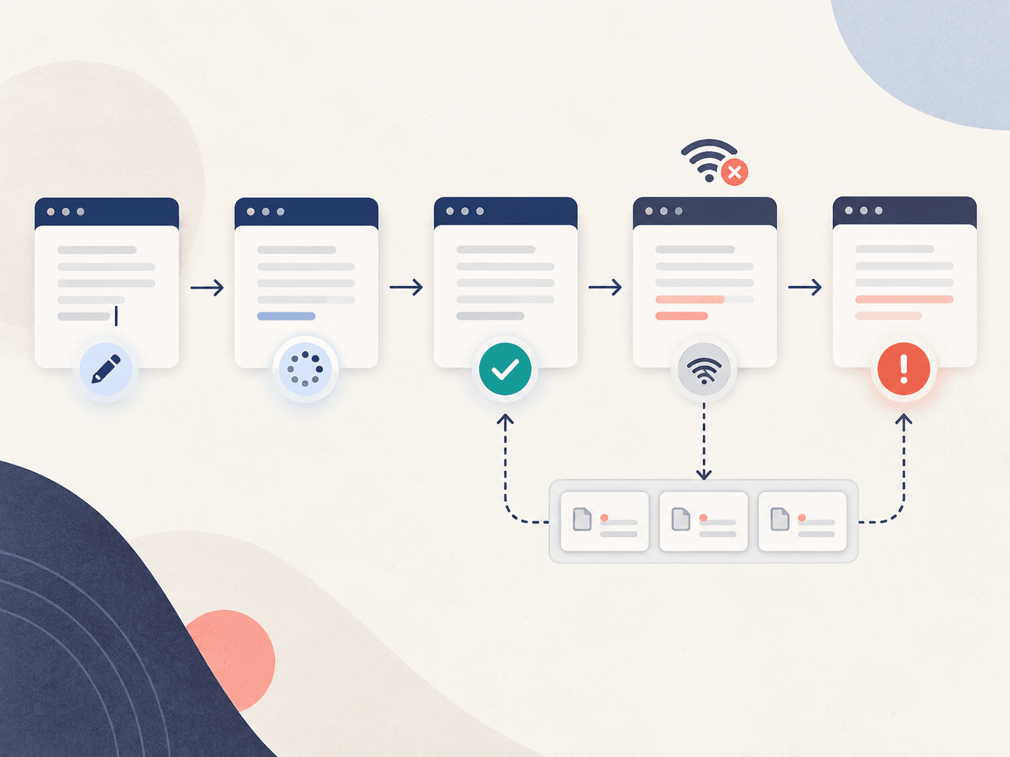
- Model the status indicator as a state machine with clear states: typing, saving, saved, offline, error. Users trust the pill more than the feature itself, so never let it read 'Saved' when the write never landed.
- When the connection drops, push every edit into a local queue and surface a badge counting what is pending. On reconnect, drain the queue in order, oldest first.
- Two tabs on one document means last write wins can silently erase an hour of someone's work. Merge concurrent changes or warn the user, but never overwrite in silence.
- Guard the exit. If unsaved work exists, use the browser's beforeunload prompt to intercept the closing tab. One ugly dialog beats an afternoon retyped.
Practical implementation rules
- Debounce writes so one clean save fires after a pause (around 800ms), not on every keystroke.
- Queue edits locally while offline and replay them oldest first once the connection returns.
- Keep the status honest by mapping it to explicit states and updating it in real time.
What to avoid
- Let the pill show 'Saved' when the change never reached the server.
- Overwrite a concurrent edit silently; merge the changes or warn instead.
- Let a tab close on unsaved work without a confirmation dialog.
Do not copy the pattern mechanically. First identify the user decision it is supporting, then choose the simplest version that makes that decision easier. Test the design with the real content, real device sizes, keyboard navigation, and slow or failed network conditions where relevant.
Easystartup publishing angle
Frame this topic around a familiar startup problem: how a small product decision can improve a measurable business outcome. Use an example from onboarding, checkout, dashboards, or marketing pages so readers can connect the UX principle to work they are already doing. The strongest takeaway is not a visual rule by itself; it is the reason that rule helps users move forward.
Quick takeaway
A good Autosave choice is one that makes the user's next step clearer while supporting the business outcome behind that step. Start with the goal, then let the UX pattern earn its place.
Ready to make your website work harder?
Start a WhatsApp conversation about your website. We’ll help you understand what’s possible — no pressure, no jargon.