Make Your Website Feel Faster With Better Motion
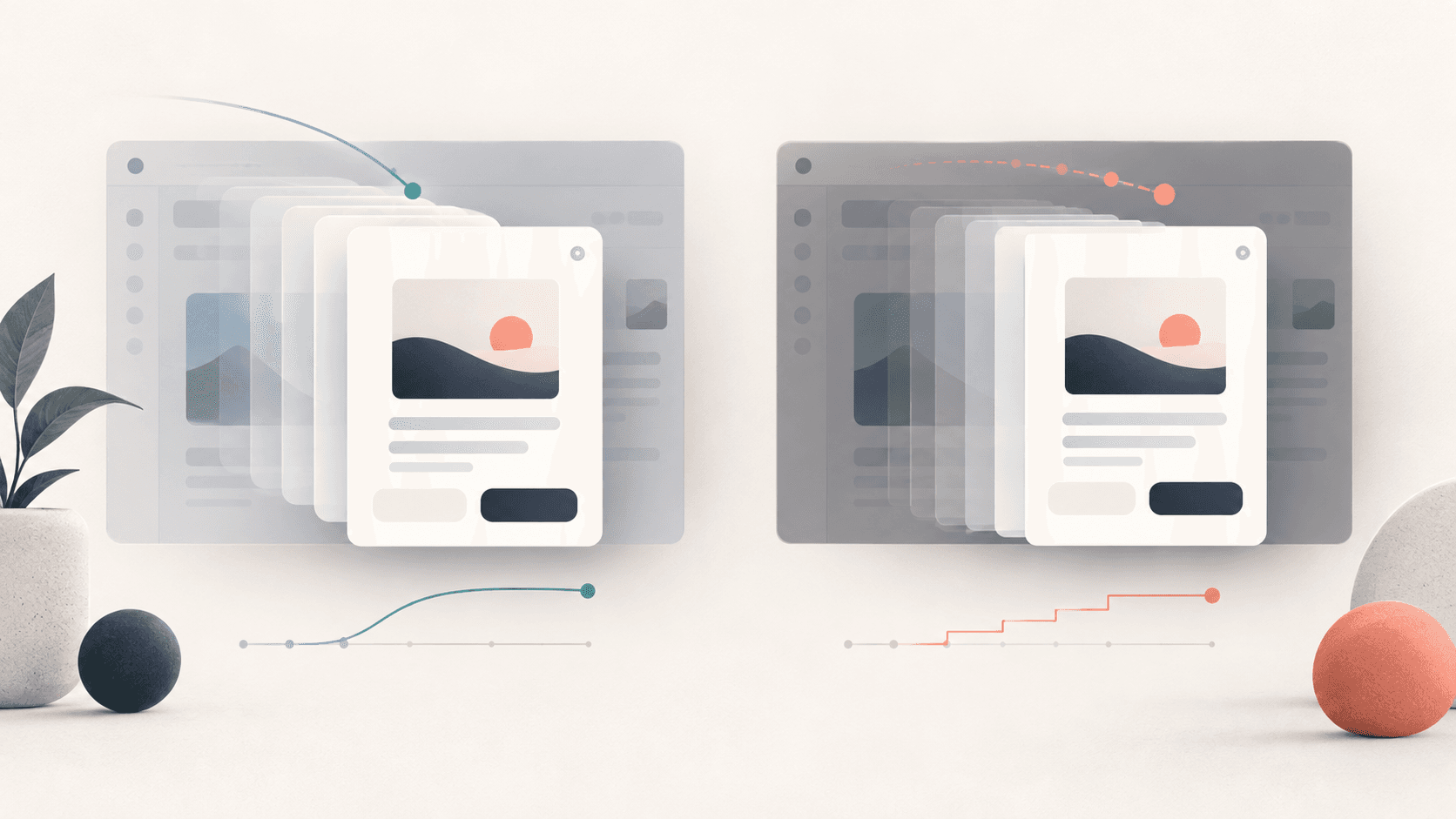
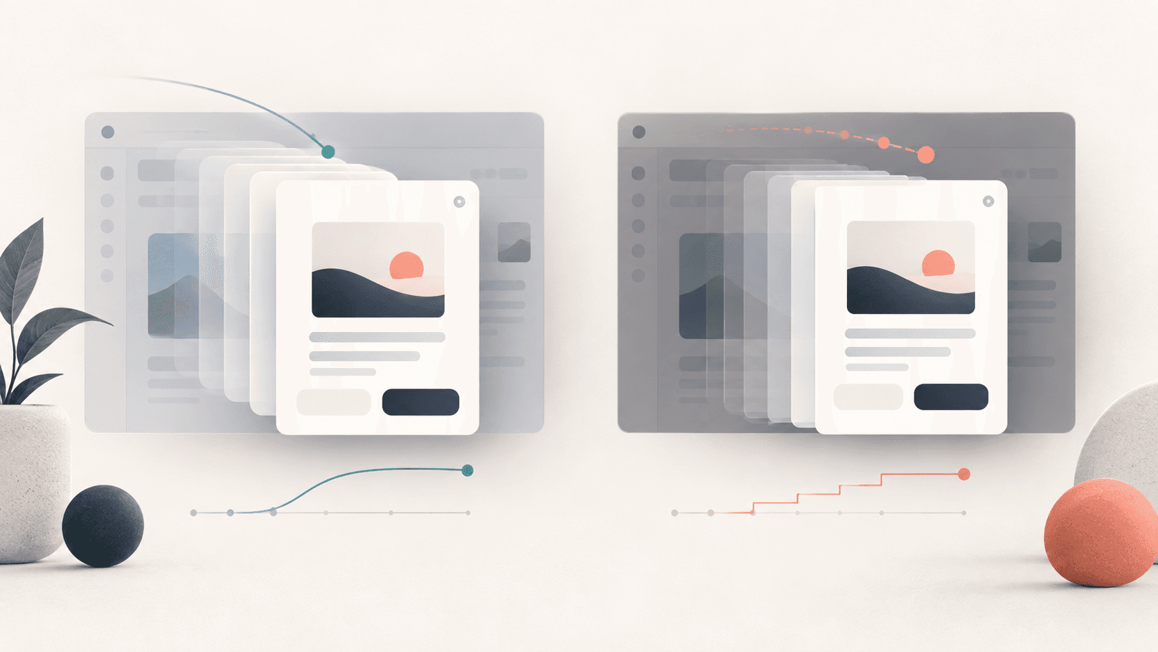
Same modal, two timings: one feels premium, one feels broken. It's all milliseconds Make the product feel responsive, intentional, and easy to understan...
The business goal
Make the product feel responsive, intentional, and easy to understand through motion.
The UX choice
Use Animation Timing as a deliberate product decision, not as decoration or a default component.
The starting point is simple: Same modal, two timings: one feels premium, one feels broken. It's all milliseconds. The interface should make the user's intent visible, keep the consequence of each action understandable, and remove friction only where it does not reduce trust or control.
Why this choice works
When this pattern is treated as a business lever, it can reduce hesitation, prevent avoidable errors, and make the next action feel obvious. When it is added without a clear purpose, it can create noise, hidden behavior, or unnecessary friction.
For a startup, this matters because small UX decisions compound across acquisition, activation, retention, and support. A clear pattern can shorten the path to value. A confusing one can turn a moment that should feel routine into a reason to abandon the product or contact support.
What to design
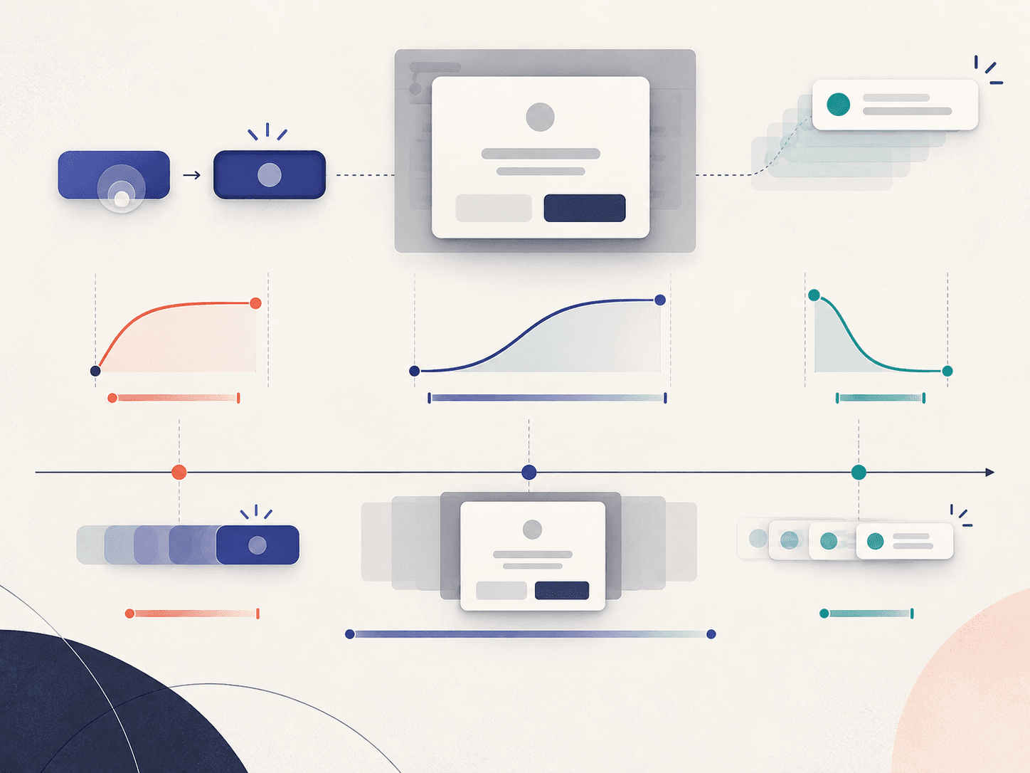
- Entrances land best at 200–300ms with a cubic ease-out — fast enough to feel responsive, slow enough to read as deliberate.
- Exits should be faster than entrances: pair a 250ms entrance with a ~150ms exit so dismissals feel snappy instead of dragging.
- Feedback on taps and button presses must fire in under 100ms — anything slower reads as lag, even when the action itself is instant.
- Attention-grabbing motion like notifications can run longer, 500–800ms, and use a bounce or overshoot to pull the eye.
- Stagger list items about 50ms apart — 30ms blurs them into one blob, 100ms makes the whole list crawl in.
Practical implementation rules
- Use ease-out curves for entrances so motion decelerates into place
- Make exits roughly 40% faster than their entrance so dismissals feel instant
- Keep tap and press feedback under 100ms so the interface feels alive
What to avoid
- Stretch entrances past ~300ms — they start to feel sluggish and in the way
- Use symmetric in/out timing — a matched-length exit feels like the UI is dragging
- Reach for linear easing on entrances — it reads mechanical and cheap
Do not copy the pattern mechanically. First identify the user decision it is supporting, then choose the simplest version that makes that decision easier. Test the design with the real content, real device sizes, keyboard navigation, and slow or failed network conditions where relevant.
Easystartup publishing angle
Frame this topic around a familiar startup problem: how a small product decision can improve a measurable business outcome. Use an example from onboarding, checkout, dashboards, or marketing pages so readers can connect the UX principle to work they are already doing. The strongest takeaway is not a visual rule by itself; it is the reason that rule helps users move forward.
Quick takeaway
A good Animation Timing choice is one that makes the user's next step clearer while supporting the business outcome behind that step. Start with the goal, then let the UX pattern earn its place.
Ready to make your website work harder?
Start a WhatsApp conversation about your website. We’ll help you understand what’s possible — no pressure, no jargon.